Architecture System Design

Architecture Blueprint of Cashebo

A dynamic, editorial-grade layout system crafted for a real-world Czech luxury casino and fine-dining restaurant — engineered for clarity, discovery, and conversion.

Contemporary European Functionalism Modern Editorial Grid
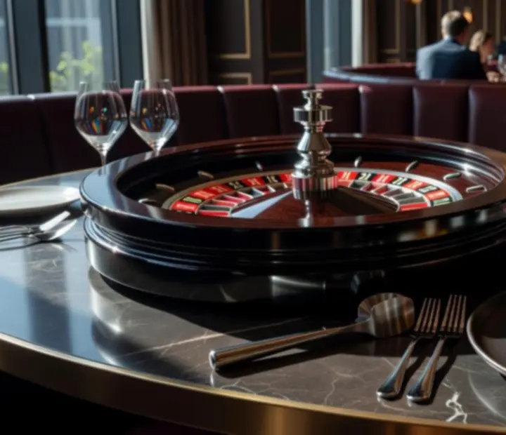
Editorial aerial view blending a premium roulette table with fine-dining plating, representing Cashebo's integrated casino and restaurant architecture.
Variable hero grid
Viewport layouts: 3 base patterns
Optimized for: Discovery & conversion
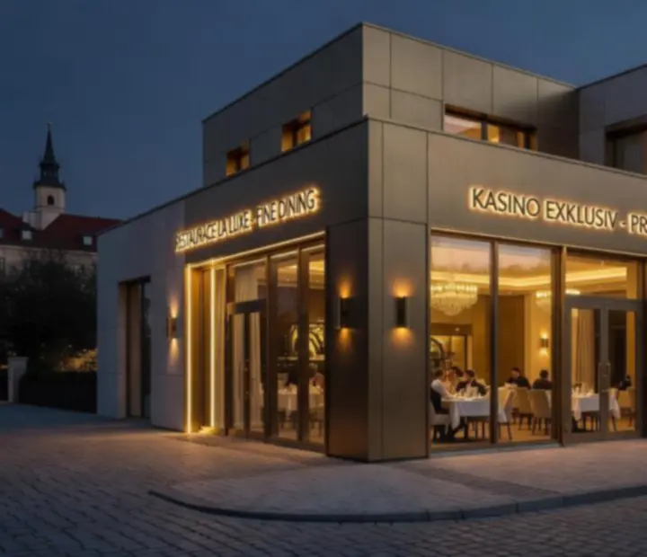
Exterior of a contemporary Czech luxury casino with integrated fine-dining restaurant, bathed in warm evening light.
Physical-world anchor

Architectural Vision

Contemporary European Functionalism, staged as Modern Editorial

Cashebo’s architecture orchestrates every pixel around the physical Czech casino and restaurant — the web layer behaves like a concierge: efficient, restrained, and theatrically precise.

The layout is engineered to feel inevitable: guests can sense where to look next without thinking, whether they are exploring the Gastronomy Menu, planning an evening in the Gaming Salon, or securing Elite Experiences.

Editorial quiet, casino energy

The visual hierarchy is inspired by contemporary magazines: generous margins, disciplined typography, and sharp 1px borders that frame content like spreads. This is balanced with kinetic micro-interactions that echo the hum of a live gaming floor and the theatre of open-kitchen gastronomy.

Key outcomes of this vision:

  • Immediate orientation via clear sections, consistent headings, and predictable navigation lanes.
  • Decision-first content — routes to reservations, location, and experiences remain visually prioritized.
  • Consistent density across articles, FAQs, and infographics to keep reading and scanning equally satisfying.
Architectural exterior shot of the Cashebo casino and fine-dining venue, illustrating the real-world anchor of the digital experience.
Every structural choice online reflects the building offline — Cashebo’s architecture starts from the facade and flows into the viewport.

Variable Hero Block Structure

Static, cinematic hero compositions — no sliders, all impact

Cashebo’s hero component uses asymmetric editorial grids to frame roulette action and artisan cuisine without relying on sliders or carousels.

Each page opens with a single, intentional composition that clarifies purpose in under three seconds.

Three primary hero layouts

  • Layout A — Text lead, imagery support: best for transactional journeys like reservations and event bookings.
  • Layout B — Image lead, text support: ideal for Gaming and Experiences where atmosphere is the headline.
  • Layout C — Full-width editorial: suited for deep informational content and architecture/technology explainers.

Metadata badges, headline, and CTAs snap to the grid in pre-defined alignments, allowing variation without sacrificing scannability. All CTAs are tied to core routes — Menu, Gaming, Experiences, Location, Contact — to keep the guest journey grounded.

Editorial grid layout mixing roulette wheel close-ups with gourmet dishes, exemplifying Cashebo's hero component.
A single hero layout showcases both roulette energy and culinary artistry, aligning headline and CTAs for immediate understanding.

Hero behaviour & constraints

  • One hero per page — to avoid cognitive overload and focus on one primary action.
  • No sliders or carousels — layout variations are achieved via grid presets, not motion-driven carousels.
  • Consistent CTA pairing — each hero presents a primary decision (e.g., view Menu, plan Gaming night) and a secondary exploration route (e.g., see Experiences or Location).

Grid Framework & Navigational Lanes

A disciplined grid with 1px borders and clear lanes

The grid system underpins every Cashebo page, delivering structural calm even when content density rises.

The grid mirrors the real venue: circulation paths, seating clusters, and gaming islands translated into digital lanes.

Container logic

Cashebo uses two main containers: a standard .container aligned to the page-max-width and a .container-wide for hero and media-led compositions.

This ensures copy-heavy pages like Privacy Policy remain readable while visually rich sections have room to breathe.

Editorial columns

The grid utilities (.grid-2, .grid-3, .grid-auto-fit) enforce a consistent vertical rhythm. 1px borders delineate blocks, creating subtle "cards" without heavy ornamentation.

Menu categories, gaming tables, and FAQ groups all inherit this rhythm, turning the site into a legible editorial system.

Navigational lanes

Primary navigation lives in the header; secondary lanes appear as section-level link rows pointing to Menu, Gaming, Experiences, Location, and Contact Us.

This layered approach keeps exploration intuitive without overwhelming the user with choice.

Color Palette & Brand Signature

Warm sand, deep graphite, and copper-terracotta anchors

The palette balances approachability and luxury, echoing polished stone, linen, and metal details of the physical venue.

Color tokens are defined as CSS variables to keep implementation consistent and maintainable across all pages.

Base Canvas

Warm sand and light beige tones create a soft, hospitality-grade backdrop that flatters both culinary and gaming imagery.

Typography in deep graphite

Text uses near-black graphite for premium legibility and editorial presence, paired with softened secondary copy.

Copper-terracotta actions

The primary accent color highlights CTAs (booking, contact, navigation hints), echoing bar metals and roulette detailing.

Application across routes

  • Menu & Gastronomy — warm surfaces with copper highlights emphasize plating and pairings.
  • Gaming — deeper graphite accents and soft highlights guide focus to table information.
  • Experiences & Location — neutral backgrounds keep photography and maps clean and legible.
  • Legal & policy pages — minimal color, leaning on typography and spacing to maintain trust and clarity.

Content Delivery Modules

Modular content blocks for precise information delivery

Articles, explanatory videos, FAQs, infographics, and downloadable resources share one design language, simplifying both authoring and reading.

Every module respects the grid, 1px border scheme, and consistent heading hierarchy.

Article spreads

Long-form content (for example, guides to the Gaming Salon etiquette or tasting notes for seasonal menus) uses a columnar layout with lead paragraphs, inline pull-quotes, and embedded imagery.

Cross-links point to related pages like Menu or Experiences to keep interest flowing.

Explanatory videos

Video modules sit inside cards with clear titles, durations, and supporting text. They are sized responsively, maintaining a comfortable reading width and keyboard-accessible controls.

Ideal for explaining house rules, dress codes, or tasting journeys before a guest arrives on-site.

FAQs & accordions

FAQs follow accessible accordion patterns with clear focus states. Sections can address gaming conduct, reservation policies, or parking and address details that link into /location/.

Each item is short, scannable, and optimized for mobile interaction.

Infographics & downloads

Infographics are framed as high-contrast image blocks with descriptive captions. Downloadable resources (e.g., event brochures or seasonal menu PDFs) live inside consistent card templates.

Clear microcopy indicates file type and approximate size to set expectations.

Accessibility & Performance

Inclusive by design, fast by engineering

Cashebo is tuned for guests on the move: fast loading, keyboard friendly, and visually clear in low-light environments common to hospitality and gaming venues.

The experience is crafted so that every visitor, regardless of device or ability, can confidently plan their night at the venue.

Accessibility commitments

  • Semantic HTML and ordered heading levels across all pages, including Terms and Conditions, Privacy Policy, and Cookie Policy.
  • Keyboard-accessible navigation, focus-visible styles, and logical tab ordering.
  • Sufficient color contrast between text, backgrounds, and actionable elements, even in low lighting.
  • ARIA labelling where needed for interactive components like FAQs, search, and forms.

Performance strategies

  • Lean, modular CSS and JavaScript with shared bundles across all major sections.
  • Responsive imagery with modern formats like WebP, including hero photography and restaurant atmospherics.
  • Prioritized content delivery — critical layout CSS is loaded early, while non-essential scripts are deferred.
  • SEO-friendly structure with clean URLs such as /technology/ and /architecture/.

Interactive Engagement Features

Contact flows and newsletter sign-ups built for conversion

Form experiences are crafted to feel as composed as a table reservation with a concierge — clear, quick, and reassuring.

The primary goal is to move guests seamlessly from curiosity to confirmed intention.

Contact and reservation forms

  • Hosted primarily on /contact-us/ with contextually placed links from Menu, Gaming, and Experiences.
  • Fields grouped logically: personal details, visit preferences, and optional notes.
  • Prominent success states and clear error feedback, with ARIA attributes on inputs where appropriate.
  • Option to deep-link from follow-up emails to a Thank You confirmation page.

Newsletter and VIP updates

Newsletter modules appear in low-friction areas: end-of-page slices on Menu, Gaming, and Experiences.

  • Single-field sign-up where possible (email-only), with optional name capture.
  • Microcopy clarifying that offerings are tied to the physical Czech venue, not online gambling.
  • Clear routes to policies: Privacy and Cookies.

Physical-World Integration

Every digital pathway leads to a real Czech casino and restaurant

Cashebo.com is architected as the digital foyer of a land-based luxury establishment in the Czech Republic — not an online gambling site.

Information hierarchy, imagery, and calls-to-action are all optimized around a single outcome: an exceptional in-person visit.

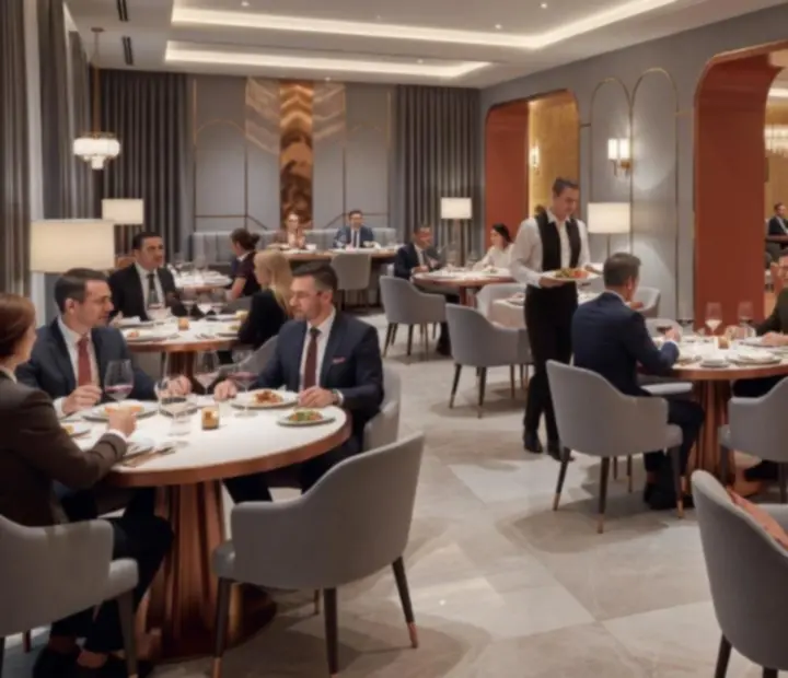
Warm, premium dining room atmosphere inside the Cashebo venue, with carefully lit tables and refined decor.
The architecture ensures that the atmosphere guests see online matches the ambience they feel when stepping into the dining room and casino floor.

Anchored in location and sensory detail

  • Location-first messaging — routes like /location/ and /contact-us/ stay within one click from almost any page.
  • Imagery curation — photography focuses on real dining, gaming, and architectural moments rather than abstract online gambling visuals.
  • Copywriting guardrails — language is tuned toward visits, reservations, and experiences at the physical property.
  • Technology & architecture transparency — pages like Technology and this Architecture overview emphasize informational quality and safety, sustaining trust.

Together, these decisions ensure Cashebo’s web architecture behaves like a precise, welcoming front-of-house for the Czech venue itself.